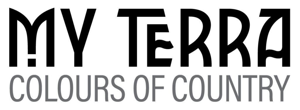
In the world of design, every detail matters. From colors to layouts, every choice you make contributes to the overall aesthetic and impact of your work. Among these choices, typography plays a pivotal role in conveying your message effectively. Choosing the right fonts can enhance the visual appeal and readability of your design, and this is where the art of font pairing comes into play. While desiging my “My Terra” logo, I really need to spend the time researching the perfect font combinations. Fontpair and Fontjoy were just two of the many websites that I usitlised to pair my two choosen fonts for the “My Terra” logo.
Font pairing refers to the art of selecting two or more fonts that complement each other harmoniously. This deliberate choice isn’t just about aesthetics; it has significant advantages that can elevate your design to a whole new level.
Enhanced Readability

Visual Hierarchy
Different fonts naturally carry different weights and personalities. By selecting fonts that contrast in terms of size, weight, and style, you can establish a clear visual hierarchy within your design. Headings will naturally stand out, guiding the reader’s attention to the most important information. For me that was My Terra, with the tagline, Colours of Country being the second most important font.
Emotional Resonance
Consistency and Coherence
Unique Personality
A few other things to keep in mind when pairing fonts
- Contrast is Key: Pair fonts that contrast each other in style, weight, and size. A bold headline font with a lighter body font is a classic example.
- Limit the Number: Stick to two or three fonts to maintain visual harmony. More fonts can lead to clutter and confusion.
- Consider Context: Your font choice should align with the purpose and context of your design. A formal document requires a different pairing than a playful website.
- Test for Readability: Always test your font pairing for readability. Make sure that your chosen combination doesn’t sacrifice legibility for aesthetics.
In conclusion, the art of font pairing is a skill that can significantly impact the effectiveness of your design. By thoughtfully selecting complementary fonts, you can enhance readability, establish hierarchy, and convey the desired emotional tone. Remember that each font carries its unique voice, and by pairing them strategically, you create a harmonious symphony of typography that resonates with your audience and leaves a lasting impression.
PROFESSIONAL EXPERIENCE
While taking this journey branding my small business venture, “My Terra,” for University, I’ve come to truly appreciate the art of font pairing. Crafting the perfect combination for my logo and overall branding was an endeavor that required time, research, and patience. I delved into various resources like Fontpair and Fontjoy, meticulously trialling different fonts to find the ideal pairing that represented the essence of “My Terra.” It was a process that demanded attention to detail, and I’m pleased that I invested the effort. The result is not just a visually appealing logo but a reflection of the heart and soul of my business. It’s a testament to the power of thoughtful font pairing and its ability to leave a lasting impression on both clients and audiences.
However, it’s essential to acknowledge that branding for oneself presents a unique set of challenges. Not only did it carry the weight of academic grades, but I also envisioned it as a pivotal addition to my professional portfolio and a foundation for my small business venture. So having the perfect fonts held so much more importance this time around than it ever has before.